Why do most slide presentations suck?
Is it because they’re impersonal? Lack emotional connection? Boring? Fail to deliver real value? Take up too much time?
The short answer is yes… to all of it. Most slide presentations are a complete waste of time for both the presenter and the audience.
We’ve all sat through live presentations and webinars where a presenter clicks through overcomplicated and overpopulated slides, one after another, reading every single line of text. I call that “Death by PowerPoint”, and it’s extremely slow and painful. And, this isn’t just a problem for coaches, consultants, and trainers.
In fact, several major generals started an initiative to have PowerPoint banned in the entire US military. Amazon — the fourth most valuable public company in the world — banned slide presentations in all internal meetings. There’s even a political party in Switzerland dedicated to decreasing the use of slide presentations, and they call it the Anti-PowerPoint Party, or APPP for short.
To be really clear, I’m not opposed to all slide presentations. I actually use them in every live event, training session, and webinar to deliver and sell my coaching programs. BUT, not all presentations are created equal.
Right now, we’ll look at what separates the good from the bad and dive into the five keys to creating world-class slide presentations that rock your events and webinars.
A New Kind of Slide Presentation
PowerPoint was first launched in 1987 as a way to create text-filled transparencies displayed through an overhead projector. Remember those things?
Obviously, we’ve made incredible leaps in technology since then, but overall, our presentation style hasn’t really evolved along with it. While some great things came out of the 80s, most of us have moved on. It’s time our slide presentations caught up. Here’s why:
First, most slide presentations over the last 30 years have been incredibly boring. One guy reads bullet points out loud from too many slides containing tiny text… and lots of it. Hello snooze-fest!
Second, text-based presentations are really slow and hard to put together. You basically have to script the whole thing beforehand. Not only do you have to write it all out, but you have to know exactly how you’re going to read it, too.
Basically, the bad design of text-based presentations makes you look cheap. We can have the best content and strategies in our market by a long shot, but if our presentations don’t reflect that quality, new prospects will never know what we really have to offer them. I know in the old days we used to get away with that, but those days are long gone.
Whenever you’re selling a service, there’s a factor of the unknown at play because most people don’t actually experience the service until they purchase it. We have to give people a sense of the quality upfront — before they ever buy it, and that’s why our presentations are so important!
When we follow these tips to update our slide presentations, things look completely different. You can create visually stunning slides that grab (and hold) people’s attention. When you have their attention they become more engaged, allowing you to double your impact. And, by using these tips to create a repeatable process, building slide presentations becomes faster, easier, and even fun.

Let’s dive in…
1. Stop Bullets
If our audience has to read line after line of bulleted text, then what’s the point of doing a presentation at all? We might as well send them a PDF and save us both the hassle, right?
But we’re not giving people a document. We’re giving a presentation, so we need to ditch the standard 5-bullets-per-slide format once and for all.
You might be thinking, “At least bullet points are better than paragraphs of text…”
I agree, but just because bullets aren’t as bad as long-form text doesn’t make them right for presentations.
Let’s say you’re giving a presentation. You click on a slide and five bullet points appear all at once. You spend a few minutes talking about the first bullet, but everyone in the room is busy reading the five bullet points on the screen. If they’re reading the words and not looking at you, then their attention is in the wrong place.
Before you move on to your next bullet, your audience already read all five. They think they already understand the point you’re making and they’re ready to move on. Even though you may have some incredible insight, people automatically and subconsciously assume they know what you’ll say before you say it. They tune out and get distracted or bored.
We need to stop using bullets. If not, we’re wasting our time and missing out on the opportunity to make the impact we want.
Instead of creating a slide with five bullets, we’ll make five separate slides — one point per slide, and we double our impact.
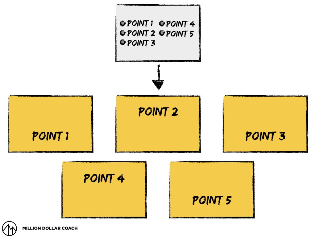
The idea is really simple. We use an image on the slide to grab their attention and include one, simple point. After they read the short text, their attention goes straight back to you while you unpack the content for them.
2. Think ‘Billboard’
Most billboards have two things in common: a dominant image and few words.

We want to apply this same concept to our slides.
As my friend Matt Church says, every piece of content has a point and some supporting stuff that makes the point. It all comes together to paint a picture for the audience.
In our slides, the text should be your point, put as simply as possible. The image we use can be a model we draw, a graphic, or a stock image that serves as a metaphor. Then, it’s up to us to elaborate on that point with supporting information.
The main idea is that the slide shouldn’t look like a document. If you really need a ton of text to make your point, create a handout for people to take with them after your presentation. Your slides should grab attention, state the point, and then put the attention back on you to support the point.
Think ‘billboard’:
- Big image
- Few words
- Keep it simple
3. Framework Before Work
The biggest mistake I see rookie coaches make is jumping straight into Keynote, PowerPoint, or whatever slide software they use to build slides right at the beginning. It’s tempting, but don’t do it.
Before we create the individual slides, we need a framework to know what we’ll talk about (and in the right order).
The secret here is to have a template for every presentation you do. For example, I have a 14-slide layout I use for every single presentation. I start with a pen and paper and map out what I want to say. Once that’s done, it’s just a matter of filling in the slides, one by one.
Depending on the kind of presentation we’re giving (sales, coaching session, live event, webinar, etc.) there’s a specific order and sequence our slides will follow. For example, we could use the Why-What-How-Now framework to build our presentation.
Without a specific framework, we can end up so deep in the details that it’s tough to get perspective. The secret to making world-class presentations incredibly easy and quick to create is by building a layout or template to follow every single time.
4. Storyboard It
In the film industry, directors never just take a script and go right into shooting the movie. Before they ever turn a camera on, they create storyboards (or shot lists) to map out how the scenes will flow. If not, they’re just making it up as they go along.
It’s the same for presentations. Creating content for great presentations hardly ever starts in the slide software.
For me, it almost always begins with pen and paper in a notebook. As digital as I usually am, and as high-tech as our company is, I’m most comfortable with pen and paper. Once I know what I want to talk about, I draw out a series of little squares (following my framework) and fill them in with the content.
You can use sticky notes, index cards, blank sheets of paper to create your storyboards. If you really have to do it on the computer, I’d suggest opening up a blank presentation (no template) and adding your text only.
5. Brand It
Once you have your storyboard, you can open your slide template and create the actual presentation using a signature style that’s all your own.
When I first started out, I read Seth Godin’s book, Really Bad PowerPoint. He talked about using big images and few (if any) words. I loved it, so my first slides were really visual, but they were also a bit rough. They didn’t really have that professional, slick quality about them I wanted.
I had two friends who were great at slide design, so I did what everyone does when first starting something — I copied what I saw. But, I soon realized I wasn’t positioning myself right. I was just mimicking someone else’s look and feel. It turns out, I was missing my own brand.
Now I have a visual design system, or style guide, that’s all my own. We use it for every slide presentation, workbooks, our website, and all other client or prospect facing materials you can think of. They all have a really consistent theme about them.
Copying other design might be a little easier at first, but it doesn’t do you any favors in the long run. Get your own vibe and create a brand from it.
When people interact with your company, what do you want them to think? What do you want them to feel? Is it stable and corporate, or are you a little edgy and funky? Think about what sets you apart and use it choose your fonts and colors.
Once you have your signature look, use it in your presentation — not only in every slide but in everything you deliver to build consistency.
[To see these tips in action on a webinar, CLICK HERE]
Aspiration and Aesthetic
Some people may think of this new way of creating slide presentations as a waste of time. This is just glitter. Only the content really matters. It won’t really make a difference.
Yes, your content matters, but ignoring the visual component is a huge mistake.
Several years back, I attended the Office AutoPilot User’s Conference. Brendon Burchard was one of the speakers, and during his presentation, he said something I thought was really interesting and useful.
To paraphrase, he said, “The companies who win are those who lead with the highest aspiration and aesthetic.”
In the old days, it was okay to use 1980’s PowerPoint, loaded with bullet points, paragraph text, and cheesy clipart, but it’s time to leave that behind. It’s time to move ahead and aspire to take your company and your clients to the highest level possible.
Creating world-class slide presentations with an intentional, crisp aesthetic is more than just “showing off” with visual design. It communicates that you, your business, and your coaching program are competent and capable of helping your clients achieve their aspirations.
How would this new way of creating slide presentations help you and your business?
Demonstrate that you know your stuff? Position you as an expert? Set you apart from your competition?
I’d love to hear what you think, so feel free to leave a comment in the box below!
P.S. Whenever you’re ready… here are 4 ways I can help you grow your coaching business:
1. Grab a free copy of my book
It’s the roadmap to attracting prospects, signing clients, and scaling your coaching business. — Click Here
2. Join the Coach Dojo and connect with coaches who are scaling too
It’s our new Facebook community where smart coaches learn to get more income, impact, and independence. — Click Here
3. Join our Implementation Program and be a Case Study
I’m putting together a new coaching case study group at Black Belt this month… stay tuned for details. If you’d like to work with me on your client-getting and scale plans… just send me a message with the words “Case Study”. — Click Here
4. Work with me and my team privately
If you’d like to work directly with me and my team to take you from 6 to 7 figures… just send me a message with the word “Private”… tell me a little about your business and what you’d like to work on together, and I’ll get you all the details! — Click Here
Ready to turn your IP into business systems you can sell?
Click here for a free download of The Signature System™


Leave a Comment